Introduction
This analysis is using data from NCAA mens and womens basketball over the last 30 years. The objective is find out how the sport shapes up using one of the most widely known sports analytical term in Pythagorean Expectation. The report will be in a series of Markdown files and will feature other sports including the NBA, NFL, NHL, and EPL.
What’s in the Report
Over the course of this report you see visuals and find out the insights in how one of the most loved sports in our country has unfolded using data science! This report will analyse how many wins teams should’ve had given their performances over the season and compare them to their actual wins achieved. It will also perform cross-sport analysis to see the differences between the sports. It will use this expected wins calculation to try to model team win totals.
library(tidyverse)
library(scales)
library(gridExtra)
library(ggExtra)
library(patchwork)
library(purrr)
library(broom)


# set up plotting theme
theme_jason <- function(legend_pos="top", base_size=12, font=NA){

  # come up with some default text details
  txt <- element_text(size = base_size+3, colour = "black", face = "plain")
  bold_txt <- element_text(size = base_size+3, colour = "black", face = "bold")

  # use the theme_minimal() theme as a baseline
  theme_minimal(base_size = base_size, base_family = font)+
    theme(text = txt,
          # axis title and text
          axis.title.x = element_text(size = 15, hjust = 1),
          axis.title.y = element_text(size = 15),
          # gridlines on plot
          panel.grid.major = element_line(linetype = 2),
          panel.grid.minor = element_line(linetype = 2),
          # title and subtitle text
          plot.title = element_text(size = 18, colour = "grey25", face = "bold"),
          plot.subtitle = element_text(size = 16, colour = "grey44"),

          ###### clean up!
          legend.key = element_blank(),
          # the strip.* arguments are for faceted plots
          strip.background = element_blank(),
          strip.text = element_text(face = "bold", size = 13, colour = "grey35")) +

    #----- AXIS -----#
    theme(
      #### remove Tick marks
      axis.ticks=element_blank(),

      ### legend depends on argument in function and no title
      legend.position = legend_pos,
      legend.title = element_blank(),
      legend.background = element_rect(fill = NULL, size = 0.5,linetype = 2)

    )
}


plot_cols <- c("#498972", "#3E8193", "#BC6E2E", "#A09D3C", "#E06E77", "#7589BC", "#A57BAF", "#4D4D4D")

M_reg_season_stats <- read.csv("/Users/andrewdarmond/Documents/Coding/march-madness-analytics-2020/2020DataFiles/2020DataFiles/2020-Mens-Data/MDataFiles_Stage1/MRegularSeasonCompactResults.csv", stringsAsFactors = FALSE) %>% mutate(Gender = "Men")
W_reg_season_stats <- read.csv("/Users/andrewdarmond/Documents/Coding/march-madness-analytics-2020/2020DataFiles/2020DataFiles/2020-Womens-Data/WDataFiles_Stage1/WRegularSeasonCompactResults.csv", stringsAsFactors = FALSE) %>% mutate(Gender = "Women")
reg_season_stats <- bind_rows(M_reg_season_stats, W_reg_season_stats)
Pythagorean Expectation
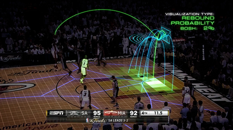
Figure 1: Shot Tracker Source: theatheletic.com
While we are easily able to count the wins and losses a team experiences, we might want to be able to assess the number of wins they had against how many wins they should have had, given their performances during the season. This might be able to tell us something about whether any luck or other factors played a part in a team’s success (or failure).
Ok great, so how do we know how many wins our team was meant to get?
Enter, Pythagorean Expectation. While many question whether he was actually the creator of the Pythagorean Theorem, the famed philosopher Pythagoras (c. 570 – c. 495 BC) had nothing to do with Pythagorean Expectation, rather, another legend of our time and one of the founding fathers of sports analytics, Bill James, came up with this for the sport of baseball.
Rather than explaining Pythagorean Expectation myself, why not consult wikipedia:
Pythagorean expectation is a sports analytics formula devised by Bill James to estimate the percentage of games a baseball team “should” have won based on the number of runs they scored and allowed. Comparing a team’s actual and Pythagorean winning percentage can be used to make predictions and evaluate which teams are over-performing and under-performing. The name comes from the formula’s resemblance to the Pythagorean theorem.
James’ formula is as follows:
win\ ratio_{baseball} = \frac{runs\ scored^{k}}{runs\ scored^{k}\ +\ runs\ allowed^{k}}
Note: the k-factor James came up with was 2, but has since been modified to 1.83 to better “fit”
Using James’ formula as a blueprint, the GM of the Houston Rockets Daryl Morey too the formula and modified it for basketball, and found that the best fit occurred when k = 13.91, leaving the folowing formula to calculate Pythagorean Expected wins for Basketball:
\(win\ ratio_{basketball} = \frac{points\ for^{13.91}}{points\ for^{13.91}\ +\ points\ against^{13.91}}\)
The output of this formula is then multiplied against games played to give the expected wins for the period analysed. This expected wins value is then compared to the teams actual wins, to determine how much lady luck played a part in the team’s season.
You must see a pattern by now. The formula remains the same, while the k factor changes based on the sport.
Different K’s
The k factor changes between sports because of the nature of the sports themselves.
| Sport | K* |
|---|---|
| Basketball | 13.91 |
| NFL | 2.37 |
| NHL | 2.15 |
| EPL | 1.3 |
*k may vary based on who has derived an “optimal” k
How can we use it?
The results have shown that winning more games than your Pythagorean Expectation tends to mean a team will decline the following season, while falling short of expectations in the cirrent year tends to mean a team will improve the following season.
# create function to apply the formula
calculate_expected_wins <- function(points_for, points_against, k=13.91) {
  expected_wins <- ((points_for^k) / ((points_for^k) + (points_against^k)))
}
NCAA Basketball - Men and Women

Figure 2: Source: Wall Street Journal, WSJ.com
We’ll start the analysis off with College basketball. This is an interesting sport to start on, and the “amateur” nature of the sport means players are only there as a stepping stone to something greater, thus making modelling for the following season’s performance fairly difficult wiht the constantly changing rosters.
The analysis on the NCAA basketball includes data from the 1985-2019 seasons.
# create a df of expected wins
expected_wins <- reg_season_stats %>%
  rename(Team=WTeamID, PointsFor=WScore, Opponent=LTeamID, PoinstAgainst=LScore) %>%
  mutate(win=1) %>%
  bind_rows(
    reg_season_stats %>%
      rename(Team=LTeamID, PointsFor=LScore, Opponent=WTeamID, PoinstAgainst=WScore) %>%
      mutate(win=0)
  ) %>%
  group_by(Gender, Season, Team) %>%
  summarise(TotalPoints = sum(PointsFor),
            TotalAgainst = sum(PoinstAgainst),
            GP = n(),
            TotalWins = sum(win)) %>%
  mutate(ExpectedWinFactor = mapply(calculate_expected_wins, TotalPoints, TotalAgainst),
         ExpectedWins = GP * ExpectedWinFactor)

expected_wins <- expected_wins %>%
  mutate(Luck = TotalWins - ExpectedWins)
Measuring Fit
Plotting the relationship between the expected wins calculated using Pythagorean Expectation and actual wins, we can see that there is appears to be a strong positive relationship for both the men’s and women’s competitions, however this relationship doesn’t appear to be completely linear.
#a1 <- expected_wins %>%
#  ggplot(aes(x= ExpectedWins, y=TotalWins)) +
#  geom_point(position = "jitter", alpha = 0.1, colour = plot_cols[2]) +
#  ggtitle("A STRONG RELATIONSHIP", subtitle = "Expected wins formula appears to be a reliable estimator of actual wins") +
#  theme_jason(legend_pos = "none")

#m1 <- expected_wins %>%
#  filter(Gender == "Men") %>%
#  ggplot(aes(x= ExpectedWins, y=TotalWins)) +
#  geom_point(position = "jitter", alpha = 0.1, colour=plot_cols[3]) +
#  labs(subtitle = "Men's competition") +
#  theme_jason(legend_pos = "none") +
#  theme(axis.title.x = element_blank(), axis.title.y = element_blank())

#w1 <- expected_wins %>%
#  filter(Gender == "Women") %>%
#  ggplot(aes(x= ExpectedWins, y=TotalWins)) +
#  geom_point(position = "jitter", alpha = 0.1, colour=plot_cols[4]) +
#  labs(subtitle = "Women's competition") +
#  theme_jason(legend_pos = "none") +
#  theme(axis.title.x = element_blank(), axis.title.y = element_blank())

#(a1 / (m1|w1))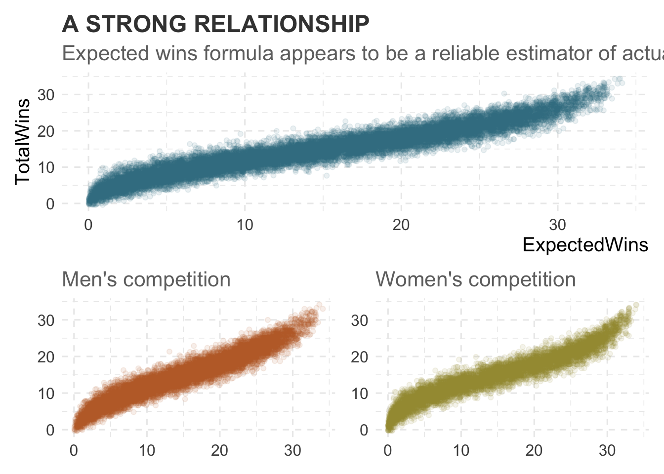
Once we calculate the expected wins, we can analyse the strength of the metric’s explainability on wins using regression analysis.
Linear Regression
Under a linear model, our adjusted Adjusted R^2 of 0.9063 tell us that the expected wins model explains over 90% of the variability in the actual wins - a very strong model.
full_lm <- lm(TotalWins ~ ExpectedWins, data = expected_wins)
summary(full_lm)
##
## Call:
## lm(formula = TotalWins ~ ExpectedWins, data = expected_wins)
##
## Residuals:
## Min 1Q Median 3Q Max
## -7.087 -1.279 -0.005 1.267 7.854
##
## Coefficients:
## Estimate Std. Error t value Pr(>|t|)
## (Intercept) 4.308665 0.027700 155.5 <2e-16 ***
## ExpectedWins 0.703562 0.001659 424.1 <2e-16 ***
## ---
## Signif. codes: 0 '***' 0.001 '**' 0.01 '*' 0.05 '.' 0.1 ' ' 1
##
## Residual standard error: 1.911 on 18594 degrees of freedom
## Multiple R-squared: 0.9063, Adjusted R-squared: 0.9063
## F-statistic: 1.799e+05 on 1 and 18594 DF, p-value: < 2.2e-16Polynomial Regression
As noted above, the relationship doesn’t look entirely linear, so we can try to fit a polynomial regression on the data to see if that will explain more of the variability.
We can see below that fitting a polynomial regression does in fact improve the explainability of our model.
Ploynomial regression achieved an Adjusted R^2 of 0.9139, slightly better than our linear model.
For the remainder of this report (unless specifically stated), when “regression” is used, we mean polynomial regression.
full_lm_poly <- lm(TotalWins ~ poly(ExpectedWins,3), data = expected_wins)
summary(full_lm_poly)
##
## Call:
## lm(formula = TotalWins ~ poly(ExpectedWins, 3), data = expected_wins)
##
## Residuals:
## Min 1Q Median 3Q Max
## -7.0692 -1.2450 -0.0261 1.2199 7.2802
##
## Coefficients:
## Estimate Std. Error t value Pr(>|t|)
## (Intercept) 14.44203 0.01343 1075.198 <2e-16 ***
## poly(ExpectedWins, 3)1 810.40635 1.83168 442.439 <2e-16 ***
## poly(ExpectedWins, 3)2 -1.89542 1.83168 -1.035 0.301
## poly(ExpectedWins, 3)3 74.26554 1.83168 40.545 <2e-16 ***
## ---
## Signif. codes: 0 '***' 0.001 '**' 0.01 '*' 0.05 '.' 0.1 ' ' 1
##
## Residual standard error: 1.832 on 18592 degrees of freedom
## Multiple R-squared: 0.9139, Adjusted R-squared: 0.9139
## F-statistic: 6.58e+04 on 3 and 18592 DF, p-value: < 2.2e-16In a later section, I will explore the possibility of there being a more optimal K factor.
Model through the years
Using the purrr and broom packages, we can easily create models for each of the seasons for each gender and analyse the explainability of the model.
Furthermore, when plotting the Adjusted R^2 over time, it can be seen that not once did the adjusted R^2 dip below 0.9, indicating that the model didn’t deviate in it’s strength over the time data is available for.
It can also be seen that the gap in adjusted R^2 for the men’s and women’s game is becomming wider, indicating that women’s teams are winning more games as expected.
yearly_regressions <- expected_wins %>%
  group_by(Season, Gender) %>%
  nest() %>%
  mutate(
    fit = map(data, ~ lm(TotalWins ~ poly(ExpectedWins,3), data = .x)),
    tidied = map(fit, tidy),
    glanced = map(fit, glance),
    augmented = map(fit, augment)
  ) %>% ungroup() %>%
  unnest(glanced) %>%
  select(Gender, Season, adj.r.squared)


lab <- yearly_regressions %>% group_by(Season, Gender) %>%  filter(Season == 2019) %>% select(Season, Gender, adj.r.squared) %>% distinct()

#yearly_regressions %>%
#  ggplot(aes(x= Season, y= adj.r.squared, colour=Gender, group=Gender)) +
#  geom_line(size=1) +
#  geom_point(data = subset(yearly_regressions, adj.r.squared < 0.9), aes(x= Season, y= adj.r.squared), colour = plot_cols[7], size=3) +
#  geom_hline(yintercept = 0.9, colour= plot_cols[7], size=1, linetype=3) +
#  geom_text(data = lab, aes(label = Gender, colour=Gender, y= adj.r.squared), hjust=0, size=6) +
#  scale_y_continuous(limits = c(0.8,1)) +
#  scale_x_continuous(limits = c(1983, 2022)) +
#  scale_colour_manual(values = plot_cols[c(3,4)]) +
#  annotate("text", x=1991, y=0.97, label= "First version of this analysis used linear\nregression, not polynomial, and the\nresults were weaker", colour=plot_cols[8], size=4) +
#  annotate("text", x=2004.7, y= 0.94, label = "First year women's\ndata available", colour=plot_cols[8], size=5) +
#  geom_curve(x = 2001, y = 0.94, xend = 1998, yend = 0.9268964, arrow = arrow(length = unit(0.02, "npc")), curvature = 0.2, colour=plot_cols[8]) +
#  annotate("text", x=2005, y= 0.89, label = "Adjusted R^2 never\ndipped below 0.9", colour=plot_cols[7], size=5) +
#  ggtitle("WOMEN'S GAME GOING MORE TO SCRIPT RECENTLY", subtitle = "The gap in Adj R^2 getting bigger since 2011 between\nmen's and women's comps") +
#  theme_jason(legend_pos = "none")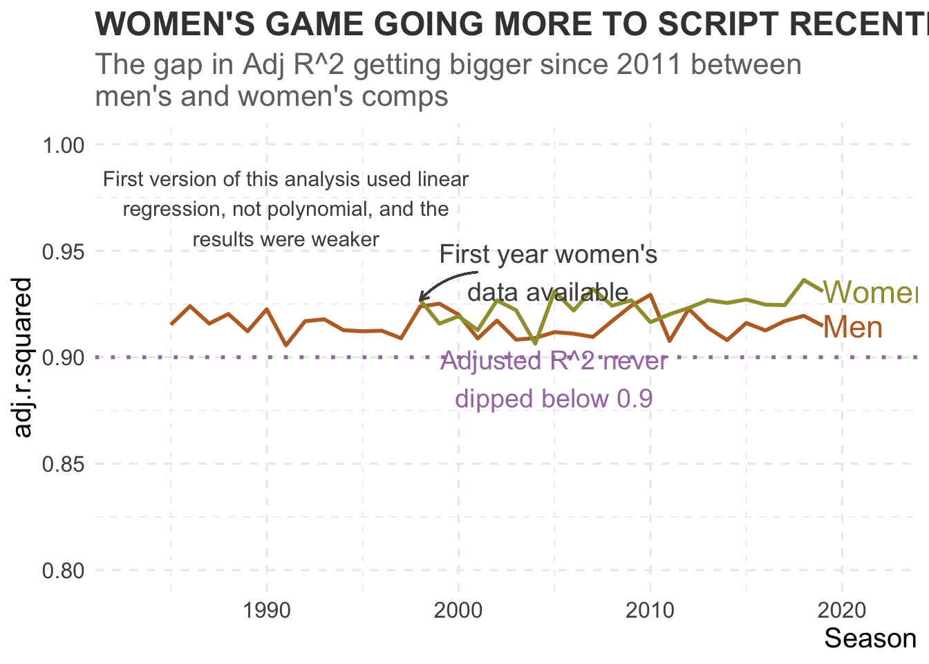
How close to reality in the NCAAB?
So a strong Adjusted R^2 is great to know, but what does that mean in games?
Well to work that out, we can calculate the average difference between what was expected and what actually occurred. The metric to use for this is Root Mean Square Error, which will give us the average absolute games difference between what was expected and what occurred.
The overall average difference in games for both genders was rround(Metrics::rmse(expected_wins$TotalWins, expected_wins$ExpectedWins),2) games, or another way of saying it, on average, teams season win totals fell within three games of their expected win totals using Pythagorean Expectation. It also tells us that luck played some part in a teams season, but not a great deal either on average.
Interestingly, even though our Adjusted R^2 for the women’s data is slightly higher than the men’s, when we look at the RMSE below split by gender, we can see that on average, the men’s average difference is 2.79 games, while the women’s is 3.63 - worse then the men’s… Maybe I’ll look in to optimising the K-factor for the women’t game.
expected_wins %>%
  group_by(Gender) %>%
  summarise(RMSE = Metrics::rmse(TotalWins, ExpectedWins))
## # A tibble: 2 x 2
## Gender RMSE
## <chr> <dbl>
## 1 Men 2.79
## 2 Women 3.63Can Pythagorean Expectation Predict Next Season’s Wins?
As explaiend earlier, my first guess was that the explainability in a team’s wins given their previous season’s expected win ratio would be fairly low, given the one-and-done nature of the college game, and the fact that players typically have a maximum of 4 years with a team.
The story may be different for professional teams given they can groom and hold on to their players for longer, and it’s something this analysis will explore further later. *** ### The Results
When fitting a regression model of team wins (both men and women combined) for a season on the previous season’s expected win ratio, we can see that the model explains 48.5% of the variability in total wins - not the worse result.
test <- expected_wins %>%
  arrange(Gender, Team, Season) %>%
  group_by(Gender, Team) %>%
  mutate(LagExpWinFactor = dplyr::lag(ExpectedWinFactor)) %>% ungroup() %>%
  filter(!is.na(LagExpWinFactor)) %>%
  mutate(LagPredictedWins = GP * LagExpWinFactor)


fit.lag.lm <- lm(TotalWins ~ poly(LagPredictedWins,3), data = test)
summary(fit.lag.lm)
##
## Call:
## lm(formula = TotalWins ~ poly(LagPredictedWins, 3), data = test)
##
## Residuals:
## Min 1Q Median 3Q Max
## -17.9797 -3.0912 0.0456 3.0847 16.6649
##
## Coefficients:
## Estimate Std. Error t value Pr(>|t|)
## (Intercept) 14.53331 0.03347 434.264 <2e-16 ***
## poly(LagPredictedWins, 3)1 571.99989 4.47439 127.838 <2e-16 ***
## poly(LagPredictedWins, 3)2 44.32120 4.47439 9.906 <2e-16 ***
## poly(LagPredictedWins, 3)3 84.80278 4.47439 18.953 <2e-16 ***
## ---
## Signif. codes: 0 '***' 0.001 '**' 0.01 '*' 0.05 '.' 0.1 ' ' 1
##
## Residual standard error: 4.474 on 17871 degrees of freedom
## Multiple R-squared: 0.4846, Adjusted R-squared: 0.4845
## F-statistic: 5600 on 3 and 17871 DF, p-value: < 2.2e-16Is it stronger for men or women?
We can also break this regression out for both men’s and women’s, and it can be seen that the previous season’s expected win ratio explains a greater amount of the variability in the women’s current season win totals (51.3%) than the men’s (46.7%).
(gender_lag_regressions <- test %>%
  group_by(Gender) %>%
  nest() %>%
  mutate(
    fit = map(data, ~ lm(TotalWins ~ poly(LagPredictedWins,3), data = .x)),
    tidied = map(fit, tidy),
    glanced = map(fit, glance),
    augmented = map(fit, augment)
  ) %>% ungroup() %>%
  unnest(glanced) %>%
  select(Gender, adj.r.squared))
## # A tibble: 2 x 2
## Gender adj.r.squared
## <chr> <dbl>
## 1 Men 0.467
## 2 Women 0.513Has that changed over time?
Over the majority of years analysed, the explainability in the women’s game has been greater than the men’s. Perhaps women’s players are staying longer at their schools compared to the men?
yearly_lag_regressions <- test %>%
  group_by(Season, Gender) %>%
  nest() %>%
  mutate(
    fit = map(data, ~ lm(TotalWins ~ poly(LagPredictedWins,3), data = .x)),
    tidied = map(fit, tidy),
    glanced = map(fit, glance),
    augmented = map(fit, augment)
  ) %>% ungroup() %>%
  unnest(glanced) %>%
  select(Gender, Season, adj.r.squared)


lab <- yearly_lag_regressions %>% group_by(Season, Gender) %>%  filter(Season == 2019) %>% select(Season, Gender, adj.r.squared) %>% distinct()

#yearly_lag_regressions %>%
#  ggplot(aes(x= Season, y= adj.r.squared, colour=Gender, group=Gender)) +
#  geom_line(size=1) +
#  geom_hline(yintercept = 0.5, colour= plot_cols[7], size=1, linetype=3) +
#  geom_text(data = lab, aes(label = Gender, colour=Gender, y= adj.r.squared), hjust=0, size=6) +
#  scale_y_continuous(limits = c(0,1)) +
#  scale_x_continuous(limits = c(1983, 2022)) +
#  scale_colour_manual(values = plot_cols[c(3,4)]) +
#  annotate("text", x=1987, y= 0.3, label = "50% explainability in\nthe variation of\ntotal wins", colour=plot_cols[7], size=5) +
#  ggtitle("PREDICTING WINS THROUGH THE YEARS", subtitle = "The Adj R^2 when regressing current season total wins\non previous year's expected win ratio") +
#  theme_jason(legend_pos = "none")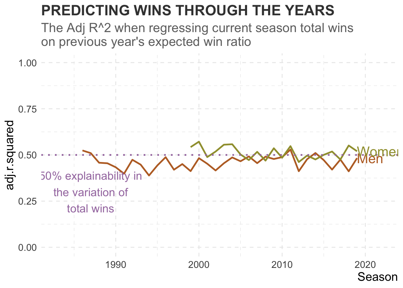
Andrew D'Armond
Leveraging data science to achieve results